Why Brand-Colour Corporate Drinkware Gifts Cost More and Get Used Less
Overview
The colour decision for corporate drinkware gifts is typically driven by brand guidelines designed for signage and packaging. When applied to a personal daily-carry item, brand-primary colours signal 'promotional item' rather than 'personal choice,' suppressing the sustained daily use that determines whether the gift programme succeeds.
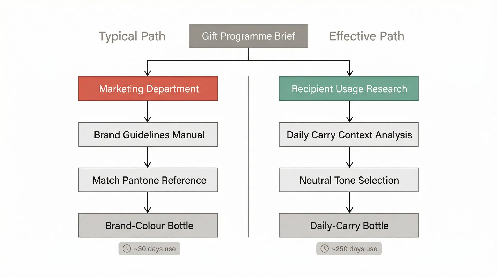
When a corporate gift programme specifies drinkware, the colour decision is almost always made by the wrong department. The marketing team, operating from brand guidelines that were designed for signage, packaging, and digital assets, instructs procurement to match the bottle colour to the primary brand palette. The logic appears sound: a gift in the company’s signature colour reinforces brand identity every time the recipient uses it. The problem is that this logic assumes the recipient will use it. In practice, the colour that maximises brand recognition on a conference table is often the colour that ensures the bottle stays in a desk drawer once the recipient leaves the office. The gap between “brand-visible” and “daily-carry” is where colour decisions in corporate drinkware gift programmes begin to produce the opposite of their intended effect.
The underlying issue is that brand colour guidelines were developed for contexts where the audience is already engaged with the brand. A website visitor, a retail customer, a trade show attendee — these are people who are in a brand interaction moment. The colour system works because it reinforces recognition within that context. A corporate gift, however, operates in a fundamentally different context. The recipient takes the bottle home, to the gym, to a café, into a meeting with a different company’s clients. In these settings, carrying a visibly branded item in a distinctive corporate colour creates a social signal that most professionals prefer to avoid. A bright orange bottle with a company logo communicates “I received a promotional item” rather than “I chose this product.” The distinction matters because daily-use drinkware is a personal item, and personal items that feel like marketing collateral get replaced by items that feel like personal choices.
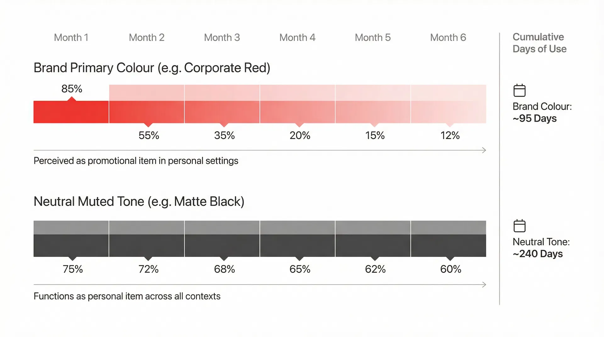
This is not a theoretical concern. Procurement teams that have tracked actual usage rates of corporate gift drinkware — and very few do, which is itself part of the problem — consistently find that neutral-toned bottles outperform brand-coloured bottles in sustained daily use by a significant margin. Matte black, stone grey, navy, forest green, and similar muted tones are carried into environments where a vivid corporate red or electric blue would feel conspicuous. The recipient’s decision to use or not use the gift is not made at the moment of receiving it. It is made repeatedly, every morning, when they choose which bottle to take with them. A bottle that blends into a professional or personal setting gets chosen. A bottle that announces its corporate origin does not.
The factory side of this equation adds a layer that procurement teams rarely see. Custom powder coat colours matched to a specific brand Pantone reference carry a setup cost and a minimum batch requirement that standard catalogue colours do not. A factory maintaining a library of thirty standard powder coat colours can switch between them with minimal downtime and no additional material cost. A custom colour match requires a test batch, a visual approval cycle, and a dedicated powder coat run that cannot be blended with other orders. The cost premium for exact brand colour matching on a stainless steel bottle order of 300 to 500 units — a typical New Zealand corporate gift programme volume — can add eight to fifteen percent to the per-unit cost. That premium is paying for a colour that, based on usage patterns, reduces the likelihood that the bottle will be carried daily. The procurement team is spending more money to produce a less effective gift.
The decision architecture that produces this outcome is worth examining because it reveals a structural misalignment in how corporate gift programmes are managed. The marketing department owns the brand guidelines and has approval authority over any item that carries the company’s visual identity. The procurement department manages the supplier relationship, the budget, and the logistics. The marketing department’s objective is brand consistency. The procurement department’s objective is cost efficiency and timely delivery. Neither department’s objective is “maximise the number of days per year the recipient actually carries this bottle.” The metric that determines whether the gift programme succeeds — sustained daily use, which drives both brand exposure and the sustainability narrative that often justifies the programme — is not owned by either department involved in the colour decision.
In practice, this is often where corporate drinkware gift decisions start to diverge from their stated purpose. The gift programme brief says “reinforce brand awareness through daily use.” The colour specification says “match Pantone 485C” — the company’s signature red. These two directives are in tension, but the tension is invisible because the people writing the brief and the people specifying the colour are operating from different assumptions about how the gift will be used. The brief assumes daily carry. The colour specification assumes brand visibility. Daily carry requires the bottle to function as a personal item. Brand visibility requires the bottle to function as a branded asset. A single object cannot optimise for both simultaneously, and the colour is the variable where this conflict becomes most visible — or rather, most consequential.
The practical consequence extends beyond usage rates. When a corporate gift programme distributes 500 bottles in a distinctive brand colour and 400 of them are not being carried after the first month, the programme has effectively produced 400 units of waste. The sustainability narrative that justified the reusable drinkware programme — replacing single-use cups and bottles — collapses if the reusable item is not being reused. The environmental benefit of a reusable bottle is entirely dependent on it displacing disposable alternatives, which only happens if the recipient uses it as their primary vessel. A bottle sitting in a cupboard while its owner buys a takeaway coffee every morning has a net negative environmental impact when the manufacturing footprint is factored in. The colour decision, which seems like a minor aesthetic choice, is the variable that determines whether the gift programme achieves or undermines its environmental justification.
There is a middle path that some procurement teams have identified, though it requires the marketing department to accept a deviation from standard brand guidelines. Rather than matching the bottle body to the brand’s primary colour, the bottle is produced in a neutral tone — matte black, charcoal, or a deep navy — with the brand mark applied in a subtle, tone-on-tone treatment. Laser engraving on a dark surface, for example, produces a mark that is visible on close inspection but does not announce itself across a room. The bottle reads as a premium personal item first and a branded gift second. This approach preserves brand presence without creating the “promotional item” signal that suppresses daily use. The factory cost is typically lower because the neutral base colours are standard catalogue options, eliminating the custom colour match premium. The branding cost may be marginally higher for a tone-on-tone treatment compared to a high-contrast print, but the net unit cost is usually comparable or lower.
The resistance to this approach almost always comes from the marketing department, and the resistance is understandable. Brand guidelines exist to prevent visual inconsistency, and allowing a corporate gift to deviate from the approved colour palette feels like a precedent that could erode brand discipline elsewhere. The procurement consultant’s role in this conversation is to reframe the objective. The question is not “should the gift match our brand colour?” The question is “what colour will result in the gift being carried every day for twelve months?” When the objective is reframed around sustained use rather than visual compliance, the colour decision shifts from a branding exercise to a behavioural one. The data, where it exists, consistently supports neutral tones for daily-carry drinkware items.
For teams evaluating which drinkware options align with specific business contexts and recipient expectations, the colour variable deserves more deliberate attention than it typically receives. The default — match the brand colour — is the path of least internal resistance, but it is not the path that produces the highest daily usage rates. The gift programme’s success is measured in days of use, not in Pantone accuracy. A matte black bottle that gets carried 250 days a year delivers more brand exposure through its subtle engraved logo than a brand-red bottle that gets carried 30 days before being replaced by something the recipient actually chose for themselves. The colour decision is small, but its downstream effect on programme outcomes is disproportionately large, and it is one of the few variables in a corporate gift programme where changing the approach costs less, not more.